Signage and Brand Identity: Communicating Identity and Guiding with Style

Signage is not just information: it is visual storytelling. In reception and waiting areas, logos, lettering and directional panels become an integral part of the interior design. Ufficiostile designs coordinated systems that combine design, readability and visual consistency to make your identity immediately recognisable and guide people naturally through the space.

Wayfinding & orientation Backlit logos Directional panels Totems and signs Brand experience
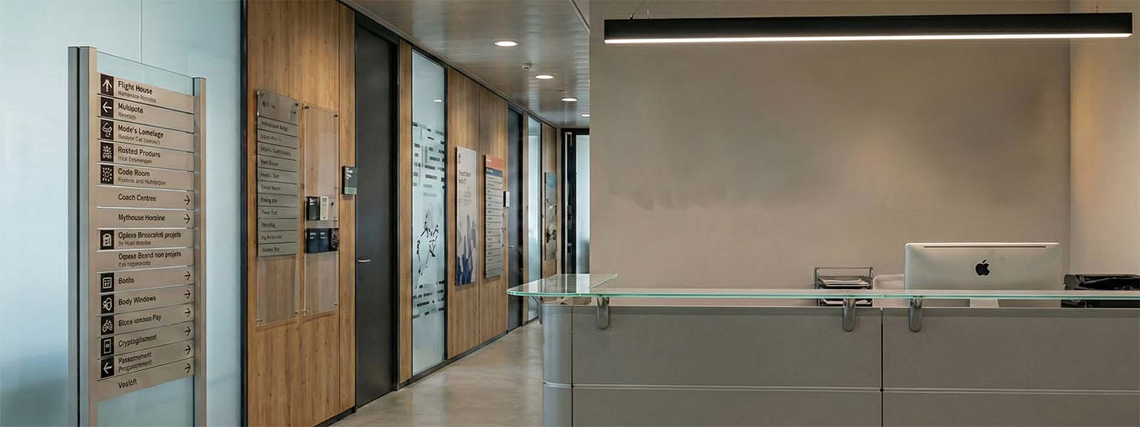
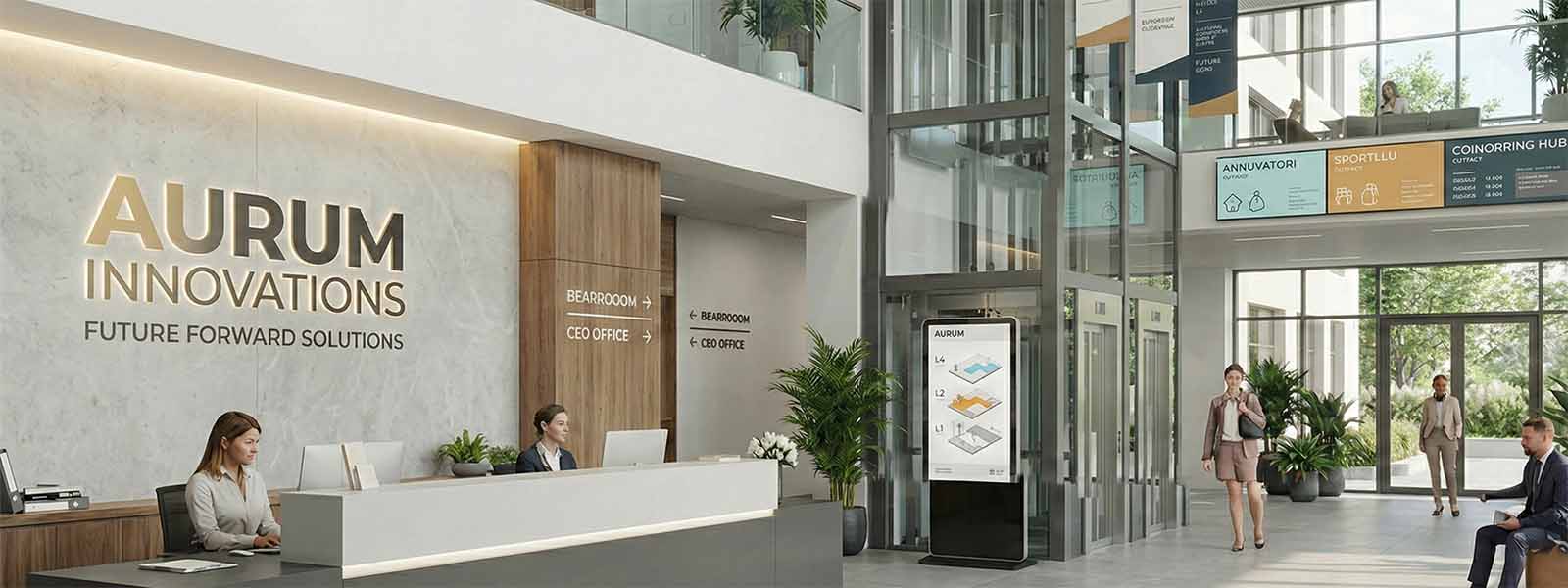
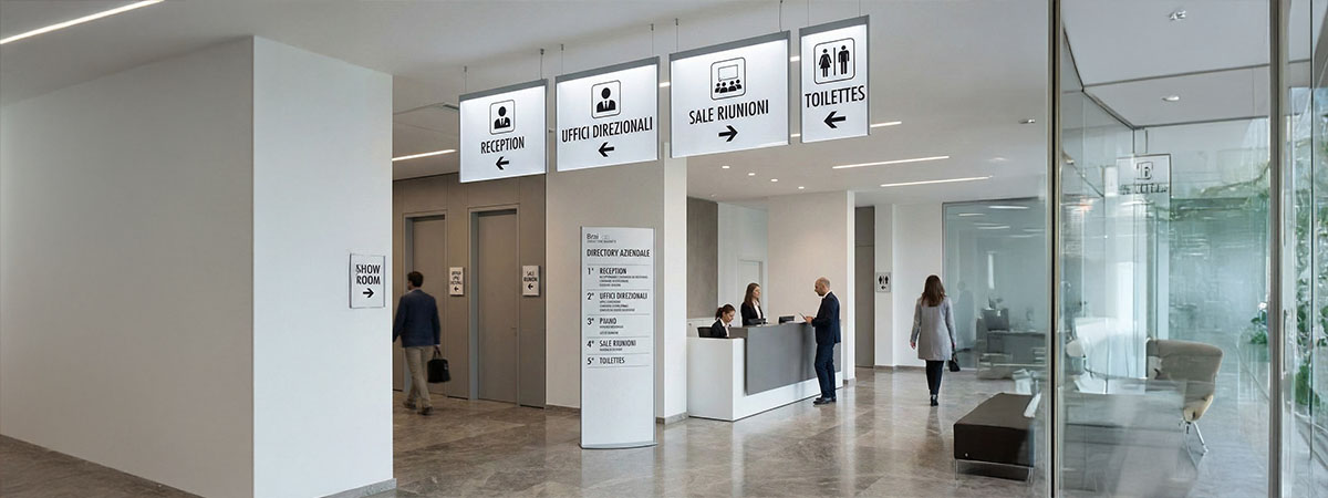
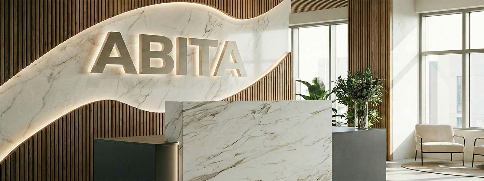
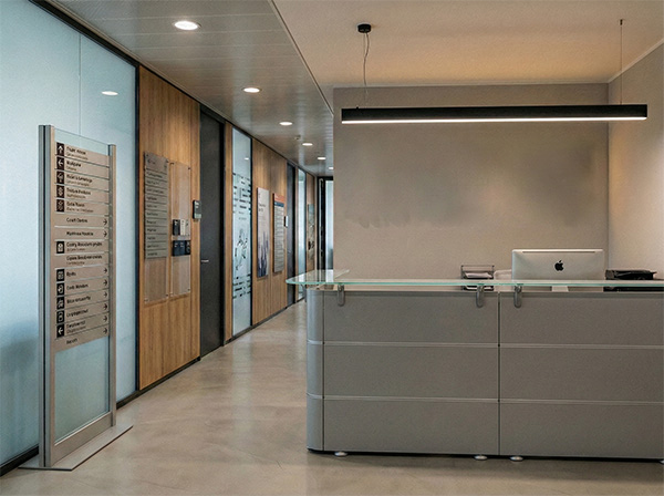
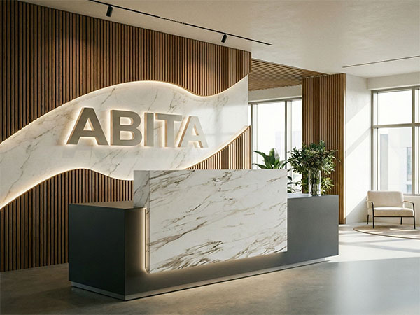
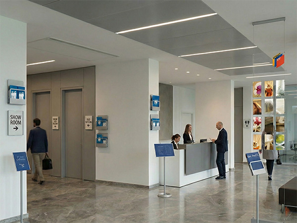
Backlit company logo on a reception wall Directional panels and information totems in a corporate corridor Universal pictograms and icons for internal wayfinding Universal pictograms and icons for internal wayfindingUniversal pictograms and icons for internal wayfinding
Velvet
 

Technical Specifications – Signage & Brand Identity

  • Indoor and outdoor signage systems in aluminium, plexiglass, glass and wood, with digital printing, engraving or 3D built-up lettering, suitable for reception areas, corridors and shared spaces.
  • Backlit logos with low-consumption LED modules, accessible power supplies and colour temperatures calibrated to the lighting design to ensure readability and visual comfort.
  • Directional panels, totems, door signs and pictograms designed for maximum readability: correct colour contrast, clear text hierarchies, universal icons and the option of bilingual text.
  • Modular systems that can be updated over time using interchangeable panels, rails, magnetic inserts and replaceable components, allowing information and layouts to be modified without building work.
Technical detail of aluminium and plexiglass signage panel
Typical signage configurations in corporate reception areas and corridors

Typical Configurations – Signage & Brand Identity

Corporate Reception

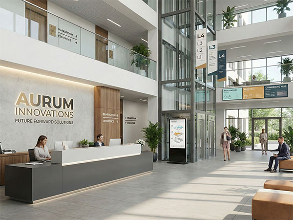
Backlit logo on the main wall, company name and tagline panel behind the reception counter, coordinated door signs and directional arrows towards meeting rooms and key offices for a clear and memorable entrance experience.

Multi-Storey Headquarters

Information totems at the entrance with floor maps, projecting and suspended signs near lifts, level numbering and coordinated floor signage to guide visitors without requiring them to ask for directions.

Public-Facing Spaces

Signage for clinics, service counters and coworking spaces with clear pictograms, area colours, service icons and updateable panels for communicating changes in opening times, routes or functions while maintaining an organised and professional image.

The Logo as an Architectural Element

A backlit, engraved or three-dimensional logo can transform a neutral wall into a strong visual focal point. Integrated into wall finishes, reception counter volumes or a feature backdrop, the brand becomes part of the space and an integral element of the interior design. Materials, thicknesses and lighting are carefully selected to enhance visibility from both near and far, making the logo clear without becoming intrusive and ensuring harmony with the surrounding furniture.

Three-dimensional company logo integrated into the reception wall
Directional panels and totems guiding visitors through the company premises

Signage That Guides and Welcomes

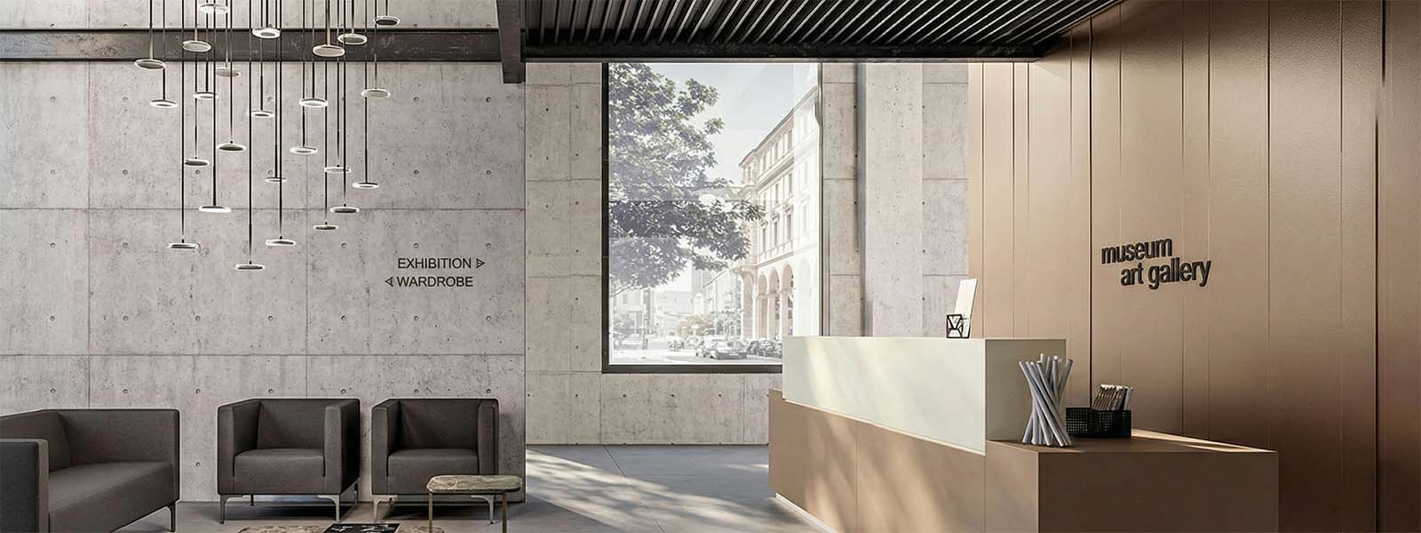
The primary function of signage is to provide orientation, but it can do so with style. Suspended panels, totems and directional signs designed with correct visual hierarchies make it immediately clear where to go, reducing confusion and enquiries at reception. Balanced contrasts, concise text and universal icons improve accessibility for non-native speakers and users with visual difficulties, creating a smoother experience that respects everyone’s time.

Colour and Typographic Consistency

Fonts, colour palettes and signage materials should speak the same visual language throughout the building. Maintaining consistency between the logo, floor panels, door signs and service communications immediately conveys care, reliability and attention to detail. Ufficiostile develops bespoke systems in aluminium, plexiglass or wood that reflect the existing branding, avoiding random combinations and overlapping elements that create visual clutter and confusion.

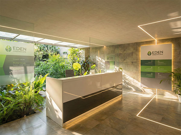
Detail of coordinated lettering and colour palette in signage panels
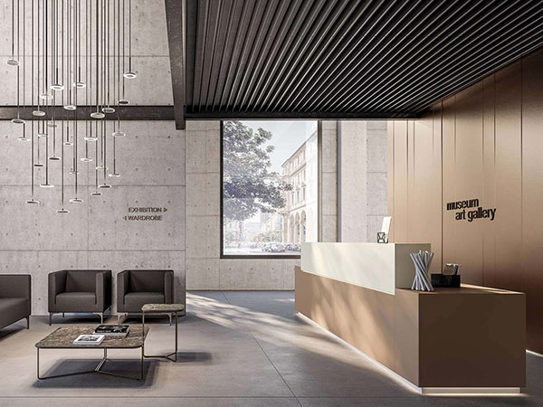
Reception area with integrated signage that strengthens brand recognition

Experiential Branding and Visual Memory

The reception area is where the brand physically meets people. A signage system that is well integrated into the architecture strengthens brand recognition: visitors should remember the name, colours and atmosphere without needing a brochure. Routes, logos and messages become stages within a single coherent experience. In this way, signage stops being merely a technical element and becomes a storytelling tool that communicates the company’s values, style and vision.

Problems & Solutions

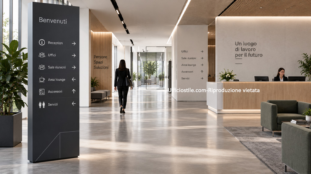
The entrance should guide visitors even before reception staff need to intervene. We coordinate wayfinding, logos, environmental graphics and digital information to make routes and corporate identity immediately clear.

Corporate reception with directional totem and integrated wayfinding system
PROBLEM

Visitors Enter but Do Not Immediately Understand Where to Go

 
SOLUTION

Entrance totems, directional signage and room identification are organised around the actual decision points visitors encounter. Colours, numbering and the position of each element make departments, lifts and routes clear from the first few metres, reducing hesitation and requests for information at the reception desk.
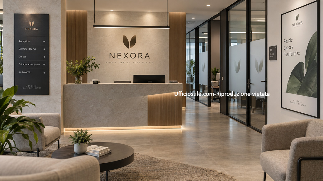
Corporate reception with coordinated logo, signs and environmental graphics
PROBLEM

Logo, Signs and Messages Use Different Visual Languages

 
SOLUTION

The main logo, directories, signs, glass graphics and information displays are developed as a single coordinated system. Colours, materials and proportions are aligned with the reception counter, walls and waiting area, transforming signage into a coherent part of the space’s visual identity.

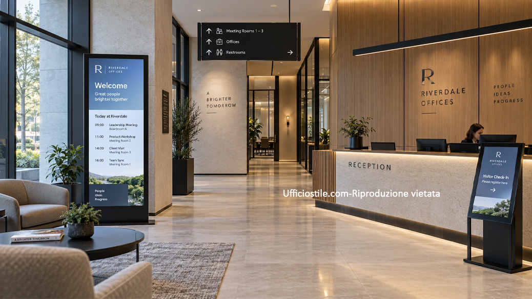
Reception with digital signage and fixed signage for updateable information
PROBLEM

Variable Information Is Communicated Using Paper Notices and Improvised Displays

 
SOLUTION

Fixed signage is reserved for permanent routes and information, while digital displays and coordinated supports manage visitors, events and temporary communications. Power and data provisions are integrated into the design, keeping the entrance organised even when content changes frequently.

FAQ – Signage and Brand Identity

Yes. Backlit logos are custom-designed according to the existing walls, finishes and systems. We use low-consumption LED modules with concealed but accessible power supplies, allowing the new element to be integrated without invasive changes to the architecture.

Absolutely. Starting from your brand identity guidelines, we define the most suitable colour palette, typefaces, materials and finishes for the space. The goal is to create a signage system that respects the brand while also providing excellent readability and durability.

Yes. Modular systems can include interchangeable inserts, pockets, rails or magnetic panels that allow names, opening times or destinations to be updated without replacing the entire structure. This reduces costs and installation time whenever the organisation chart or space layout changes.

Absolutely. We design panels, logos and totems in continuity with reception counters, wall panelling, fitted walls and storage walls so that the intervention appears to be part of the original design rather than a later addition disconnected from the rest of the space.

Yes. A clear and consistent system reduces confusion, lightens the workload of front office staff and makes the flow of people smoother. Intuitive routes, readable icons and concise messages improve the user experience and leave a positive impression of the organisation.